INDEX

COVID-19 Impact Project
Overview
Together with other designers, data science experts, and developers, we worked together to redesign a social resilience data research platform regarding COVID-19’s impacts on NYC neighborhoods. Two main objectives were: 1) to redesign the interface for better engagement and usability, and 2) to design data visualizations for empathetic data storytelling.Timeline: October 2022 - September 2023
Project Type: Social Resilience Research Project, Data Visualization Design, Interaction Design
Role: UI/UX Designer & Developer
Team: Shindy Johnson, John Henry Thompson, Yu-Ying Lee, Kaitlyn Zou, Alfonssette Medina, Marjorie Yang
![]()
![]()
![]()
![]()
Project Type: Social Resilience Research Project, Data Visualization Design, Interaction Design
Role: UI/UX Designer & Developer
Team: Shindy Johnson, John Henry Thompson, Yu-Ying Lee, Kaitlyn Zou, Alfonssette Medina, Marjorie Yang
Problem 1. User Engagement & Usability
The COVID-19 Impact Project’s website presented challenges in user engagement.

WordPress Analytics revealed:
- Unstable & decreasing user activity by 87% in Q4 of 2022.
- Bounce rate of 44.7%.
And the main culprits, after further investigation, were:
- Confusing navigation - 10 menu items and unclear menu names.
- Information overload - excessive text and repeated information throughout the pages.
- Lack of visual stimulation - lack of visual identity with dull colors, typography, and a lack of illustrations/imagery to help with textual clarity.
- Inconsistency in object sizing, margins, and spacing throughout the pages makes the site look messy and disorganized, making the information even more difficult to digest.
Testing and assessment revealed that the site needed a stronger visual theme and branding, as well as improvements in readability and usability.
Reorganizing the information
After assessing the current site, key insights revealed issues with the site’s structure and navigation. I designed a simpler information architecture to highlight the most important info and reduce info overload for users.Main adjustments involved:
- Reduction of menu items from 10 to 7
- Clearer organization of information
- Elimination of repeated/unimportant information

Visual Branding & Identity
The site’s lack of visual identity and uniqueness weakened the project’s impact.The site is about mortality and remembrance, presenting information about real people and their lives. How do we use design to emphasize its seriousness without it feeling too grim or uncomfortable to read through? How can we utilize motifs to align more closely with the project’s mission?
After many consultations to nail down specific keywords to describe what we want, and then iterations, testing, and discussions about color schemes and typography.


Design System Application to Site Map
Once we finalized the information architecture and the design system, we began to create high-fidelity mockups.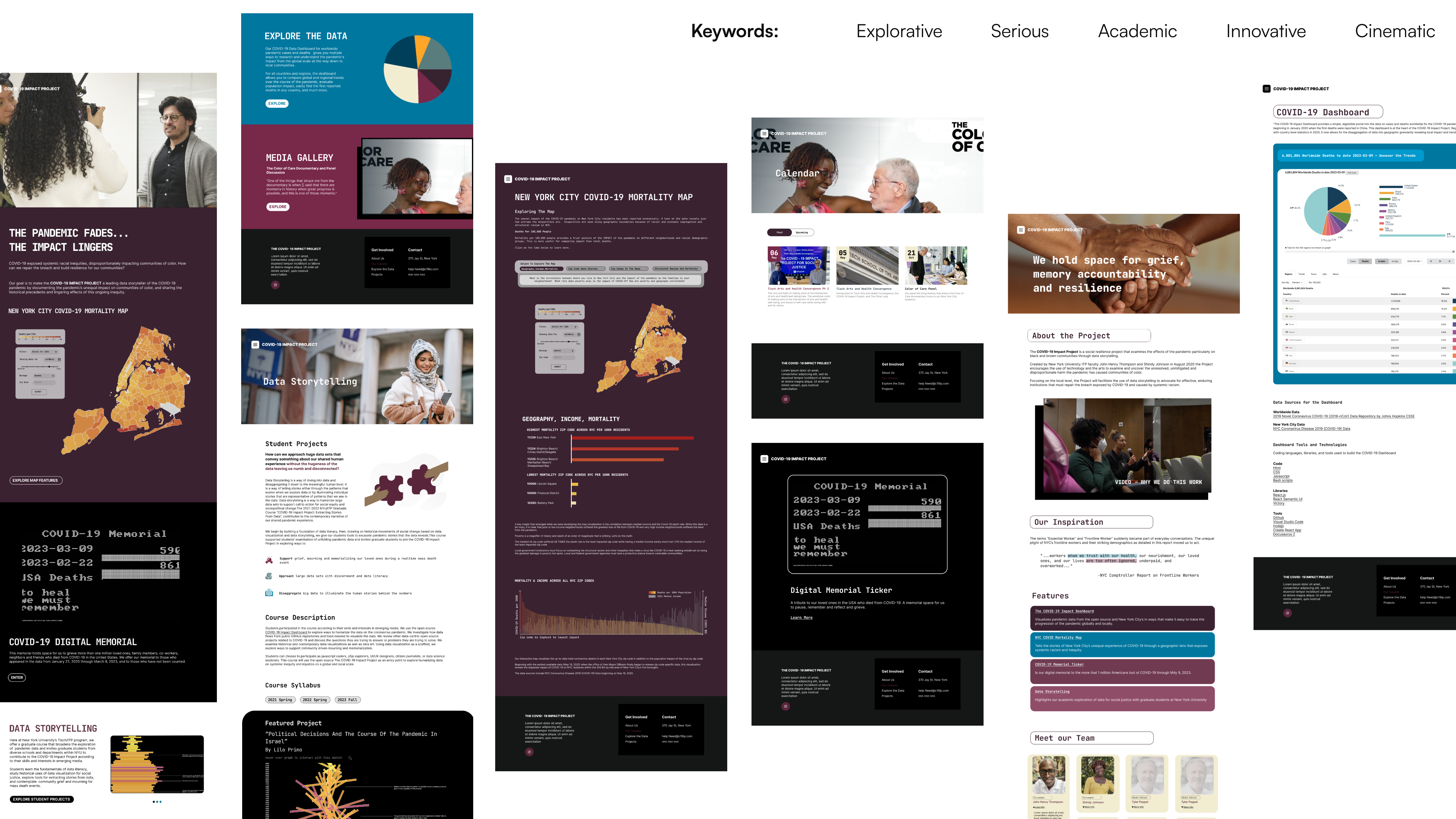
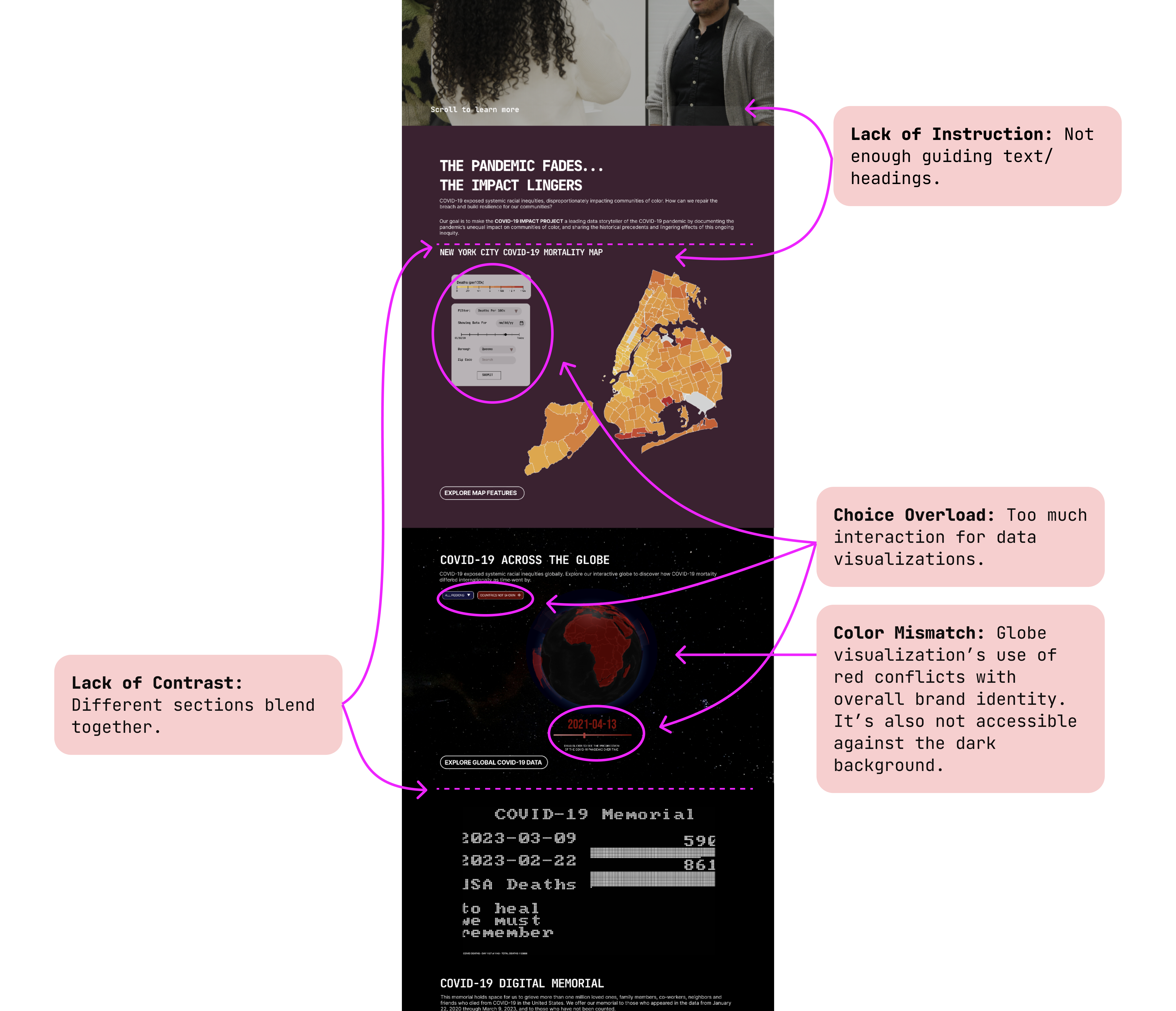
Iterating on the Landing Page
After some more user testing with our landing page mockup, we found that the design still had issues in clarifying the project mission - especially with so much unfamiliar interactive data visualizations to process and interact with.We needed better storytelling. We then began to:
- restructure,
- focus on copy,
- and simplify data visualization interactivity.
All the adjustments were about guiding the users thoughtfully, instead of simply presenting the information.
Previous Design (expand for detail)
![]()
Iterated Design (expand for detail)
![]()

Evaluation
Our project faced difficulties in user engagement. The primary challenge was nailing down the visual identity and organization of information to help improve readability, usability and visibility.
Solutions
To address these challenges, we conducted research to assess the different reasons for low user engagement, strategized on the primary fixes, ideated and produced deliverables, conducted user testing, and finally iterated our designs based on testing insights.Impact
The site began with information overload and confusing navigation, which obscured the message for many users. By streamlining content and restructuring for simplicity, we enhanced user engagement, demonstrating the significance of clear information organization and flow on the impact of the information on users.Moreover, our new visual branding helped to strengthen the emotional impact of the site. By understanding what the tone should be, how users feel, and how visual design connected the two, we were able to produce an empathetic design that drove user engagement and action.
Problem 2. Data Storytelling
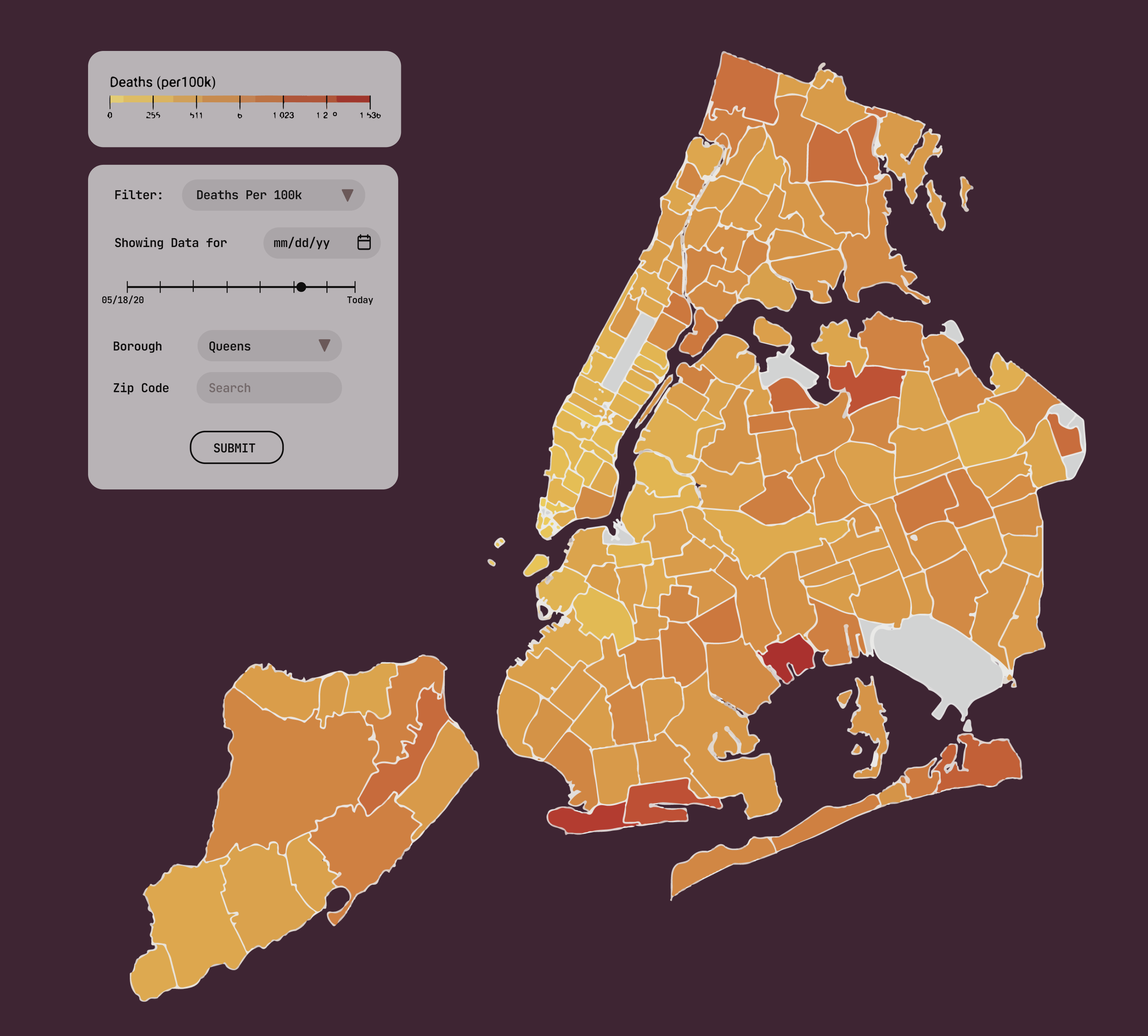
The COVID-19 Impact Project presented challenges in conveying insights on social inequality from the pandemic’s mortality data. Specifically, the issue was presenting this data in an intuitive and impactful way to a diverse audience.From the following developed data visualization that presents the mortality rates across NYC zip codes in color saturation,
How might we:
- Highlight a strong correlation between median income and COVID-19 mortality rates?
- Show the overall trend of low income = high COVID-19 mortality rates throughout the city?
Solution Development
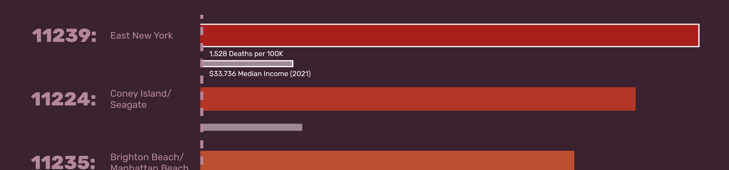
1. How might we highlight a strong correlation between income and mortality?
Our project manager suggested showing the zip codes with the highest mortality rates versus those with the lowest. I designed the bar chart below, with accurate bar height proportions. Colored bars represent mortality, and gray bars represent income.
Design choices involved:
- Horizontal bars to account for computer screen width.
- High color and length contrast, when mortality is side by side, reaffirms the strong correlation.
- Wider mortality bars to emphasize its focus and significance.
- Removal of numbers to highlight the correlation.

User testing insights revealed that numbers were still necessary. However, we still wanted to emphasize scale rather than numbers.
Solution: Interaction design refinement - added flashing white borders on hover to indicate interactivity. Hovering over bars reveals data numbers.
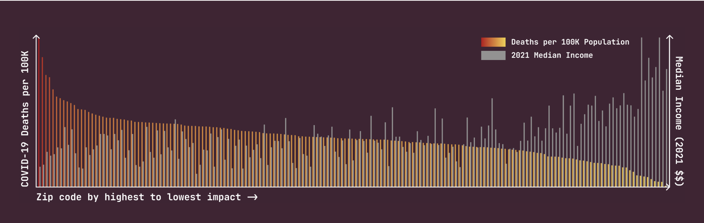
2. How might we show the overall trend of the negative correlation throughout the city?
Inspired by a web animation where the difference in circle size represents the number, our Lead Designer and manager collaborated to design the initial design below.
Interaction: the bottom slider drags through 6 zip codes of even income intervals, highlighting the negative correlation throughout the city’s data.

Assessing Feasibility
I was skeptical of this design because I knew that datasets were never perfect. I decided to test this hypothesis by manually finding each data point needed. I found that because the data was staggered, it was not possible to depict a steady trend while retaining complete accuracy. I provided this illustration to the team, explaining why the design wouldn’t work.Reassessing and taking inspiration from an infographic I found, I provided an alternative solution: a full-spectrum bar chart including mortality rate on the left y-axis and median income on the right y-axis. This way, the staggered data points wouldn’t impact the overall message.
Although this eliminated the interaction element, this new design aligned more clearly with the story we wanted to tell.
Evaluation
Our project faced hurdles in clearly visualizing the socio-economic disparities exacerbated by the pandemic. The primary challenge was to ensure that the data visualization was both comprehensible and impactful for a diverse audience, highlighting the relationship between neighborhood income and COVID-19 mortality rates.