INDEX

Overview
For my undergraduate thesis project, my peer and I designed and developed an NYC green roofs informational website to motivate NYC tenants to advocate for green roofs and democratize sustainable living.Timeline: October 2023 - December 2023
Role: Researcher, Designer & Developer (team of 2)
Project Type: Website (UI/UX)
Team: Qiqi Zhou
![]()
![]()
![]()
![]()
![]()
![]()
Role: Researcher, Designer & Developer (team of 2)
Project Type: Website (UI/UX)
Team: Qiqi Zhou
Problem Identification
Urban land use change strips away natural defenses to rising temperature, leaving civilization vulnerable to increased extreme weather events, stormwater flooding, and the urban heat island effect.
NYC is ranked #1 in the Urban Heat Island index per capita, and on average, it feels 9.5°F hotter.
Building green roofs throughout the city can help to mitigate these impacts, especially the Urban Heat Island effect.
Working together with my peer Qiqi, we tried to envision what society would look like with nature integrated into urban landscapes as a way to mitigate climate change effects in metropolitan cities like NYC – focusing on roof space as a missing opportunity for added greenery.
How might we incentivise the NYC community to implement more green roofs so that city dwellers can reap the sustainable benefits while helping to mitigate climate change impacts?
What is it?
An informational website that uses information and interaction design strategies to increase awareness, dispel misconceptions, and promote implementation of green roofs in NYC.
Evaluating the current policies regarding green roof implementation and seeing its stagnant growth, we wanted to see how we might be able to propel this process by incentivizing the NYC community to implement more green roofs using mediums of information design, interactive 3D models, and data visualization, all combined into an accessible website that we developed. The website is separated into four main pages: 1) Why Green Roofs, 2) What are Green Roofs, 3) Learn about Your Neighborhood Environment, and 4) How to Take Action. This elaborate design and development plan aims to target NYC tenants, increase awareness, and dispel misconceptions surrounding green roofs, encouraging city dwellers to advocate for them and imposing pressure on private building owners and policymakers to implement them. This way, everyone can reap the sustainable benefits while also contributing to mitigating the impacts of climate change.
Demo
Page 1: Why Green Roofs?
Page 2: What are Green Roofs?
Page 3: Know Your Neighborhood
Page 4: How to Take Action
Click here to experience the website yourself.
Research
Our journey began with a general interest in climate change mitigation strategies and sustainable urban planning, where green roofs came onto our radar. We then dove into a wealth of literature to understand their role in urban landscapes, focusing on their ecological, social and economic impacts.To understand the current climate of NYC to see if green roofs were a viable focus, we evaluated the current state of green roof implementation in NYC and the policies involved. Research showed that the NYC government is taking steps to increase green roofs throughout the city, but in a way that shows slow and stagnant growth:
“Local Laws 92 & 94 require solar panels or green roofs to be installed on all new construction projects (approved after 2019) and buildings undertaking major roof renovations.”
In reality, these laws only apply to a minor proportion of roof space in the city, telling us that the larger proportion of roof space, on existing buildings, was a missing opportunity.
Primary Research - Expert Interviews
To gain a better understanding of the topic, we conducted interviews with two environmental studies professors. Their expertise provided insights into the political, cultural, and ecological perspectives of green roofs.Ankit Bhardwaj offered perspectives on the political and sociological aspects, discussing NYC’s real estate dynamics and tenant perspectives. He described NYC as having a “unique political economy” with its large population of renters instead of home owners, making urban implementations like green roofs much more difficult than other cities.
Sonali McDermid offered perspectives on how green roofs interact with enviornmental systems on a micro and macro scale, how climate change may impact green roof longevity, and shared her expert knowledge on the potentials of urban roof farming in filling nutrition gaps.
Alongside our secondary research, the expert interviews provided us with perspective on green roofs in the context of NYC’s particular political and environmental ecosystem.
Data Gathering and Analysis
To gauge a general awareness and sentiment towards green roofs, we developed and distributed a survey. Our participants ranged from 20-30 years old with most living in Brooklyn and others in Manhattan. Our survey revealed that:
- All participants rent their homes in NYC.
- 71% of participants have heard of green roofs before, and out of these participants, 57% learned about it through school, 28% from social media, and 14% by word of mouth.
- All participants view green roofs as beneficial. However, when asked what terms they associated them with, 85% answered “expensive”, and “luxury”, with 28% answering “gentrification.”
- When given the a brief overview of what green roofs were and what they do, all participants showed strong interest in wanting a green roof, most wanted to learn more, and most showed strong interest in wanting their landlords to pay for it.
The survey revealed:
-
An interest for green roof education.
- A strong interest for green roof implementation.
- Misconceptions around green roofs - connotation of being “expensive” with the existing rent burdens NYC tenants already face.
Comparative Study
With our goal of creating an informational website platform, we needed to assess and evaluate related platforms. We found three key platforms: Green Roofs NYC project by Parsons students, their data visualization of existing green roofs, Open NYC’s Environment & Health Data Portal (EHDP), and educational interactive NY Times articles.Green Roofs NYC
Parsons students identified a need to put together various resourses and research into a singular informational hub in 2019, where the Green Roofs NYC project was born. This is an excellent resource for people who are already interested in green roofs and would want to learn about more specific subjects like green roof biodiversity. However, the information provided doesn’t guide users on how to take action from a renter’s perspective.Moreover after conducting a UX audit, we found that the hub’s UX doesn’t meet key industry standards:
- Navigation exceeds the standard quantity of 4-7 items.
-
Static blocks of information look clickable due to confusing visual elements like rounded edges, outlines, and shadows.
- Background images obstruct text readability.
- Font families, text size, and color are inconsistent throughout the platform.

[Screen captures of greenroofsnyc.com interface with markups overlayed]
Green Roofs NYC - Data Visualization
As part of this website project, the group created a 3D data visualization mapping out all the existing green roofs built until 2018. This component of the project was successful in seeing the lack of green roofs throughout the city, but was difficult to navigate with its unclear labels.Seeing how this project told a story of the past, we wanted to see how we could help people visualize the present and future with green roofs using real-time data.

[Screen capture of Green Roofs NYC’s data visualization hub interface]
Open NYC’s EHDP
We found this data portal to be extremely effective in communicating stories through simple data representations. The site had interactive colored map visualizations of various topics including the vegetative cover percentage of each neighborhood in 2017. Alongside the map, various forms of data presentations allowed us to see beyond the numbers and into their relationships with other urban and social factors like neighborhood poverty.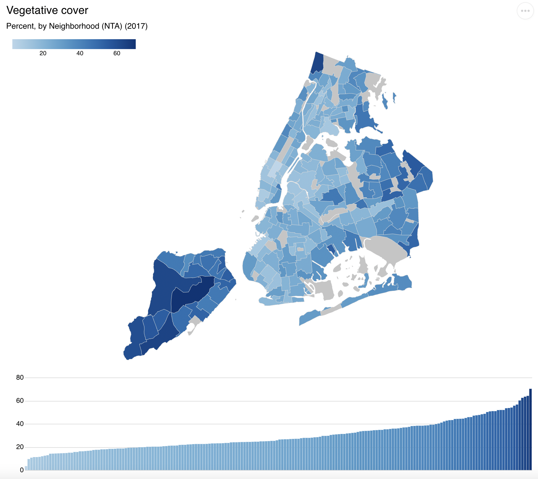
NY Times Interactive Articles
As this project had an educational aim, strategies to keep users engaged was crucial. During our research, we came across several NY Times articles that inspired us, with their animated storytelling, different forms of interactivity, and clean illustrations.
[Screen capture from NY Times article: “How to Cool Down a City”]

[Screen capture from NY Times article: “How to Cool Down a City”]

[Screen capture from NY Times article: “How Much Hotter Is Your...”]
Ideation: Information & Interaction Design Strategies
We then began to ideate on what forms of information we would want as part of the site. The below are some of the final ideas detailed, and the ones we chose to further develop (highlighted in green).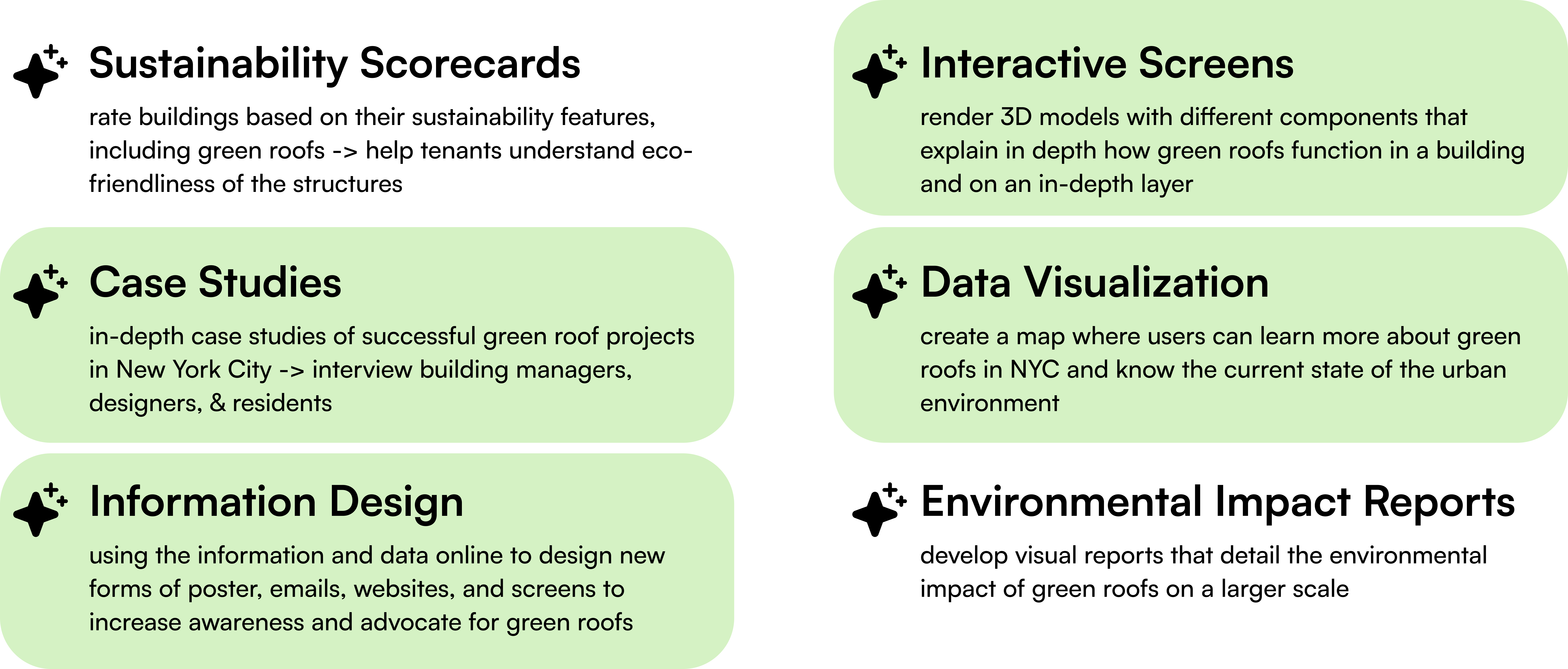
Assessing Technical Feasibility with Data Viz
We were unfamiliar with designing and developing data visualizations, but we knew that this would be a component that added significant value to our work. To assess whether this would even be a feasible plan, we did research to see the available public databases that were relevant, and talked to data visualization experts affiliated with NYU, Yi Yin and Shirely Wu, who helped us to draw out a roadmap of the steps we should take.We found that the Open NYC’s EHDP website had an external link to a public GitHub repository. Through here, we were able to get multiple datasets of different topics that had a similar format - making what would’ve been an extremely technical data cleaning and transformation process somewhat easier.
Additionally, while we wanted to craft and design a story first before collecting our different dataset, the reality is that there are a limited number of public databases, and most datasets are incompatible with one another. This limitation meant that the assessment of technical feasibility was crucial to moving forward with the project.
Design
Because we were incorporating multiple forms of media onto one site, we needed to organize our information in a way that was easy to understand.Information Architecture
We came up with a main structure, integrating important topics that came up during the primary and secondary research, and thinking about how to best convince users to advocate for green roofs.We decided the pages would be separated by, with the following reasons:
- Why Green Roofs?
[Introduction to a need for more greenery in NYC] -
What are Green Roofs?
[Detail what exactly green roofs are, and what they do] -
Know your Neighborhood
[Contextualize the previous information in relation to the user’s own neighborhood] -
How to Take Action
[Direct lead into action]

Desktop Wireframes
To understand how this would be structured on the actual website, we created desktop wireframes. Because of the complexity of space that desktop design presents, we chose to prioritize design and development ondesktop, and work on mobile if our remaining time allowed.
Branding Assets
The current interfaces for the competitive websites were a bit outdated, unintuitive, and not engaging. With so much information presented, we wanted to create branding assets that could cover all corners effectively. Written Content
While the written content of the site is more of an asset preparation process, we wanted to this aspect to be thoughtful in its language and form to optimize user engagement and comprehensibility.The style of language we chose was: brief, concise, and convincing. To test this, we interviewed people between our drafts on Notion, and iterated on language and structure.
Illustrations
Following inital inspiration from NY Times articles, we wanted to create clear and simple illustrations by our text to make the overall website feel lighter, and more inviting. Our goals for the illustrations were: engaging, informative, vibrant, and cohesive.

Development
There were three main components of the site that needed to be developed other than the actual website. Due to our limited manpower, time constraints, and the complexity of this project, we decided to use a site builder instead of coding the site from scratch. We chose to use ReadyMag as it was cheaper compared to other platforms for allowing user collaboratio – a critical feature for us.However, because neither of us had used this tool, we had to get through a learning curve, which involved looking up tutorials and frequent Google searches. Using Readymag, we first set up a website structure according to our information architecture diagram to fully focus on separate components and add them to the website when we wanted. As Readymag was more suited for building desktop screens rather than mobile, we solidified our plan to work on the desktop development.
Due to user interaction and coding limits of Readymag, we hosted the three main components on GitHub Pages, and inserted them as iframes.
1. Scrolling Animation
Programming Languages: HTML, CSS, JavaScriptFor our first page, “Why Green Roofs?,” we wanted to incorporate a scrolling animation similar to the design of the NY Times article about “How to Cool Down a City,” where the user's scroll plays one image after another to create a smooth moving animation.
We first captured screenshots of the NYC map on Google Maps, with each screen capture zooming in closer toward the green roof of NYU’s Kimmel Center. These screen captures were then coded to toggle in opacity as the user scrolls down their window.
With this working zoom-in effect, we added text sections that would flow up with the user’s scroll. For the finishing touch, we created some overlays to illustrate heat and rain using CSS keyframe animations alongside some simple static illustrations we made using Adobe Illustrator.
View the result here.
2. Spline.3d Models
Going on to the second page, “What are Green Roofs?,” we decided to build two 3D models using Spline.3d: - One to illustrate how a basic green roof works on a building,
- And the second to showcase what one’s green roof could look like with added elements beyond plants.
We delegated the work separately, with me working on the first model and Qiqi working on the second. We added simple interactions through mouse triggers and conditionals so that tapping objects or buttons in specific orders would stimulate animation and text pop-ups. This interactivity to our Spline models allows for a more explorative learning experience for users.
Play with model 1 here.
Play with model 2 here.
3. Data Visualization
The data visualization development part of our project was undoubtedly the most challenging but also the most rewarding. Our process consisted of the following steps:- Data Collection (NYC.gov Github Repo)
- Data Cleaning
- Data Transformation with Node.js
- Frontend Integration with Leaflet
- Request Handling JS
- Coding Visuals
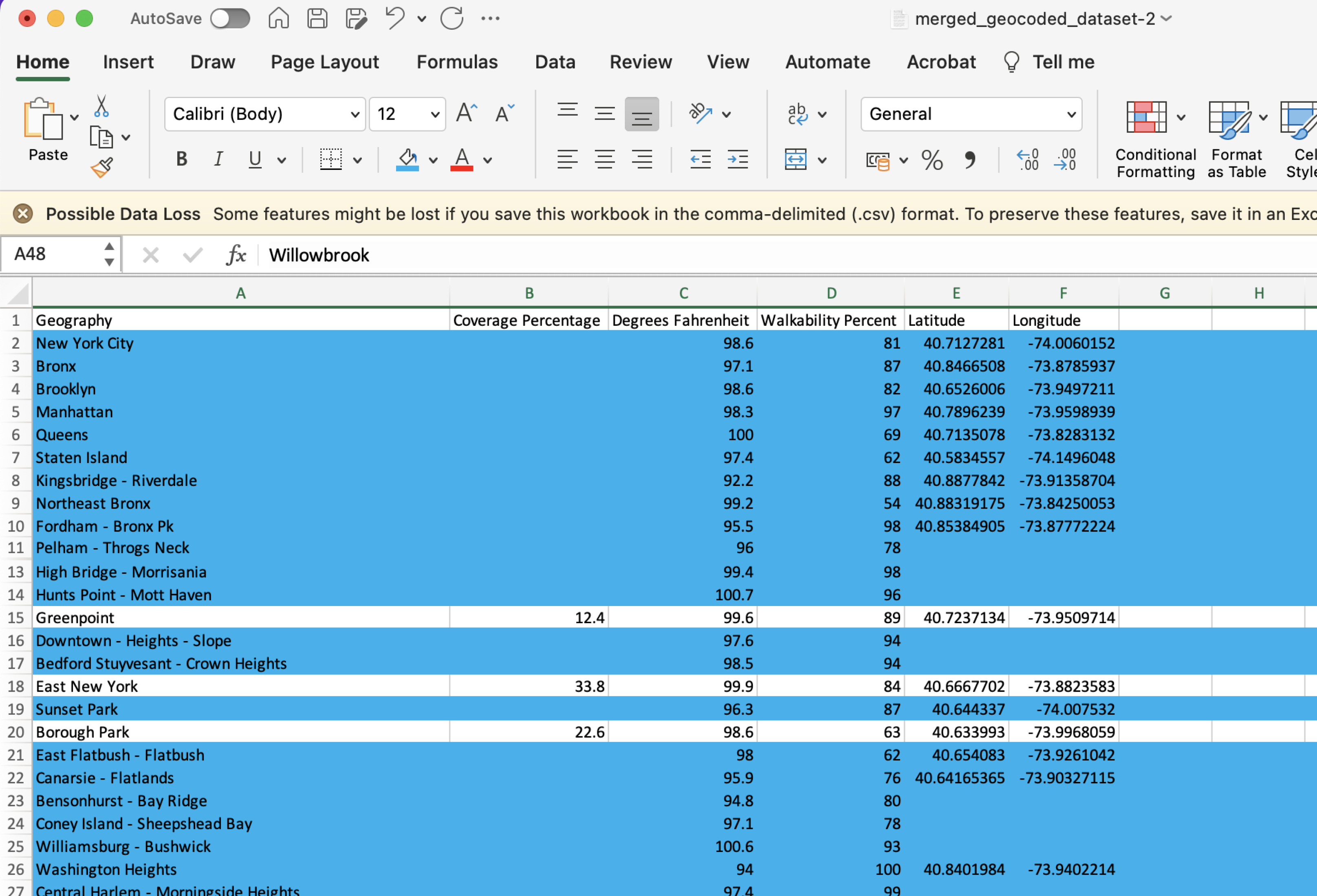
While cleaning the data, we discovered that: government-collected data isn’t as clean as you’d think.
There were multiple issues with the datasets including incomplete/human altered neighborhood names for each data point, counterintuitive information, and missing data columns.
In search for some answers, we did some stalking and found the email of the NYC open gov data viz developer, where we sent a nice email with questions in hopes of understanding his methodology.
He didn’t respond...

He also restricted access to the datasets. But, thankfully, we already had them downloaded.
To re-evaluate, we consulted with Shirley Wu again for some advice and decided to do manual data entry to fix up the data inconsistencies. To account for biases in the data transformation, we documented every decision we made.
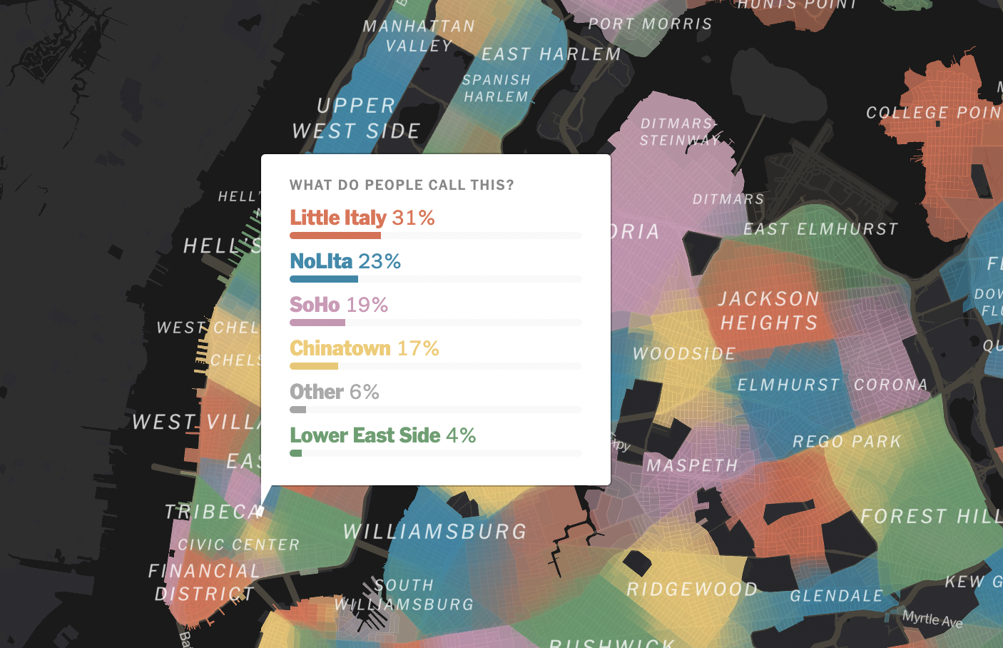
Problem #1: Neighborhood Naming Conventions
There are no concrete definitions of locality for neighborhood names. While one person might consider an area Nolita, another might consider it as Little Italy. The below screenshot of a survey conducted by the NY Times confirms this subjectivity. Solution: I chose to focus on the coordinate data instead of the neighborhood areas. I then obtained the coordinates’ zip codes from Geocod.io. If multiple data points are within the entered zip code, each would show on the map. This solution ensured a more accurate representation of location information, circumventing the issues of fuzzy neighborhood identifications and inconsistent naming.
Problem #2: Incomplete Data Columns
Incomplete data columns meant that users wouldn’t be able to get the full results of the story provided. Because the design of the data visualization required all of the data available to form the user experience, presenting incomplete data to users might take away from the core message.Solution: we deleted all data rows with incomplete data (roughly 150 data rows). This solution ensured that our core message was strong while retaining accuracy.
To handle the data requests, we initially wanted to set up a server-side to handle requests directly from the data sets to account for data updates from the gov side. However, we discovered that server-side code doesn’t work on Github, and the developer had already hidden the datasets on GitHub Repo anyway. To work around the frontend method, we converted our CSV data into JSON and wrote javascript functions to handle requests and retrieval.
Our final touches involved adding the interactive map with markets by integrating the javascript library, leaflet.js, and touching up the appearance of the site with CSS.
Try it for yourself here.
Collaboration Process
Being the first people from our program to collaborate on a thesis, it was a journey of overcoming new territories for us, our instructors, and the program organizers. Despite the novelty of the situation, we were able to work together successfully through constant communication, our weekly Tuesday and Friday cafe meetups, clear delegation of tasks, openness to critique each others work, and always coming to a consensus on topics of disagreement. Moreover, our use of collaboration-friendly digital platforms was able to boost our workflow, making our hybrid group work much easier than it could’ve been. Some notable software include Figma, ReadyMag, GitHub, and Notion.Evaluation & Future Outlook
- There is no effective and fast web based software for 3D modelling. We had to opt for design or speed - and ultimately decided on speed for better UX, sacrificing several aesthetic components of the models.
- We lacked thorough testing and refinement due to the scope of the project and time constraints. Moreover, our testing mainly involved already tech-savvy participants - diversity is important, especially when designing non-conventional interactions.
- Designing data visualization is dependent on what data is available for development. Thus, we had to first find the public datasets, understand them, plan out their feasibility, then begin to craft the story we want. This was a backward process but showed the reality of designing data.
- The public government datasets we used for our data viz had several inconsistencies and missing data columns. With no response from the developer-side, we made decisions that ultimately had an extent of bias.
- During our thesis presentation, we received feedback from critics, Sharon De La Cruz and Tong Wu, who mentioned that while we showed promising outcomes in convincing people that green roofs are worth fighting for, it might be hard for the NYC community to truly envision the reality of having a green roof. The implementation of community success stories or even guides on what species to plant could help resolve this.
The beginning of this project began with the focus of “awareness.” And throughout our making process, we got a little lost in the technicalities and details of the project’s scope. It’s important to also look at the larger impact and assess how to measure our impact. As we think about the future outlook of this project, we need to ask ourselves questions like: How do we realistically spread this information to raise as much “awareness” as possible? To what extent does this current information from our website spur people to take action and share it with others? We were initially really excited about how this could work in the physical sense – with information design across the cityscape. We thought about wheat-pasting posters, looking at NFC tap technology and potential subway ads or subway station screen interactions like the three screens we showcased. Now that we have a platform with its main components built and feedback on what else to consider for this digital platform, a physical design that accompanies our digital website can be an outlook toward building momentum on “raising awareness.” We could then measure the success of awareness through the forms of technical click rates and retention rates, along with community success anecdotes.